Living with dyslexia can be a constant struggle for individuals as they make compromises to fit into a society conditioned by neurotypical thinking. And there is no doubt that this struggle is exacerbated due to a lack of support, understanding, and knowledge of dyslexia.
Stats suggest that dyslexia influences 1 in 10 of us in the UK* and 49% of all classes have at least one student with dyslexia* so driving awareness and conversations on how we can help is essential if we are to give our children the best start in life.
The British Dyslexia Association (BDA) is clear that if a child isn’t diagnosed in their formative years, it can leave a lifelong impact so we need to look for the signs, talk to children and parents about their challenges, and tailor teaching and learning to meet personal needs.
October is #DyslexiaAwarenessMonth and it kick-starts this week, 3- 9 October 2022, with #DyslexiaAwarenessWeek. The theme ‘breaking through barriers’ aims to reflect and share stories of how others have overcome obstacles in their lives and celebrate success stories despite daily challenges faced in work and education.
We're following #DAW22 for inspiration and will be sharing inspirational stories, stats and facts throughout October - why not join us on social?
And if you have the time, be sure to book one of BDA's Dyslexia Awareness Week webinars:
- Wednesday 5 October - Supporting Spelling and Times Tables
- Thursday 6 October - Resources and Approaches for Teachers
Can Tinted Paper Help Dyslexia?
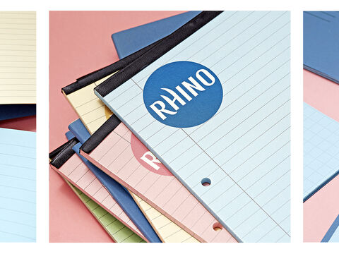
Judging by the great reviews we get, especially from parents, tinted paper can indeed help. Increasingly popular, tinted paper is now widely recognised as a solution to the type of visual stress symptoms associated with dyslexia:
- patterns, stripes, black/white and colour contrast can be stressful and lead to headaches, fatigue, and anxiety.
- the environment may be perceived as a distorted world so stationary objects can blur, move and change.
Here at RHINO, we've designed our exercise books and refill pads with the right shades to help reduce and relieve the symptoms of visual stress - the perfect support for dyslexia, Irlen's syndrome, autism and other neurodiverse diagnoses. Just be prepared to try a few colour options to find the one that suits best.
To shed more light on this, the National Autistic Society explain that difficulty with visual perceptual processing is not an ‘eye’ problem. It affects well over half of the people with autism but also occurs in approximately 15% of the population**.
It is caused by hypersensitivity to certain wavelengths in full spectrum light which provoke the brain to process visual information incorrectly. So, whether you have a diagnosis or not, you may still find there are benefits from using a tinted paper!

Creating Dyslexia-Friendly Content
To help you create written and printed materials, here are 5 top tips that you'll also find in the BDA's Style Guide for Creating Dyslexia-Friendly Content.
See a link to the full guide below, which goes into plenty more detail on how to adopt best practice and covers other accessibility guidance.
1. Use Tinted Paper
Avoid white paper and instead use dark coloured text on a cream or soft pastel colour background which can reduce jumpy lines, distraction, and glare.
2. Matte Paper is Best
Avoid gloss paper and use matt paper, it should be thick enough to prevent the other side from showing through (which is why our refill pads are 80gsm as standard).
3. Try Different Paper Shades
Each individual will have their own colour preference, so work together to find the colour that suits them best. In school, it’s ideal to have a variety of colour tints to hand as children will find that some hues work better for them than others.
Refill pads will be perfect to try different colours on a page by page basis and once you know which colour works best, then you can invest in the right tinted exercise books.
4. Use Size 12 Font Size
If you're using handouts, font size should be 12-14 point or equivalent (e.g. 1-1.2em / 16-19 px). Some dyslexic readers may request a larger font and remember to print on the colour paper that suits them best.
Use sans serif fonts, such as Arial and Comic Sans, as letters can appear less crowded. Alternatives include Verdana, Tahoma, Century Gothic, Trebuchet, Calibri, Open Sans.
5. Bold Your Text For Emphasis
Avoid underlining and italics as this can make the text appear to run together and cause crowding, instead use bold for emphasis.
Download the full Dyslexia Style Guide: Creating Dyslexia Friendly Content from the British Dyslexia Association

 Rhino Stationery
 My Own Stationery
 Aisling Stationery
 Amazon.co.uk